Sunday, September 21, 2014

Flower cut

I am continuing to work with the abstract slicing technique I started at the beginning of last semester. Below is my most recent image and video created from it:


I tried to make the video smoother, with more frames. Photoshop can apparently only handle 72 frames per animation, so I had to make it in 4 segments and piece it together in iMovie. It was extremely time consuming, and I'm not entirely thrilled with it. I think flowers were not the best choice. I wanted an image with shallow depth of field, which would kind of snap together in the center at the flowers, but remain fairly abstract until that moment. The flowers sit on top too much though, I need to reconsider that technique, probably fragmenting the image differently. The flowers are too decorative I think as well. I am now working with images that are more snap shots of my life. I think it will make the work more personal, while avoiding misleading environmental reads of the work.

I attempted to salvage something usable from the above image, because I did find the lower half interesting. These are some crops. I think a triptych is potentially interesting as well.


I plan to attempt some physical experiments soon. (Waiting for some supplies to come in the mail!) I was looking at Wade Guyton. His work depends on on the conflict between the materials and the printer, often resulting in streaks and other imperfections. I have a couple ideas, but we'll see what happens. In the mean time, I've been researching some of David Hockey's polaroid images, when he'd create large scales collages. He commented in one interview that these collages compressed four hours of time in a single work, and I think including multiple images in my work could be interesting, if it portrays a passage of time. 

Thursday, September 11, 2014

Mentor Meeting 1


I met with Cameron Martin, my mentor this semester, earlier this week and am very excited to be working with him. The meeting went very well. I came into it feeling rather scattered. I have many ideas and directions pulling me, and I found the our conversation grounding. I brought samples of most of my work from this program as well as my most recent experiments. (This may have been excessive. I've found sometimes there can be suggestions to do things I've already done and hoped this would move as past that.)

I had tried a new technique just before our visit that I'll call "opacity prints." I isolated elements digitally, lowered the image's opacity and then ran the physical paper through the printer multiple times. 


10% Opacity, 13 passes through the printer total

My thought was the registration would be off and there would be a "ghost image" affect, but actually, the printer was better than I expected. If you look at the edges closely, there is a slight staggering, but the general affect is a dull, blurry, bad print. 

Cameron suggested maybe moving the image digitally to get a stronger affect. We discussed what it means to do something physically versus digitally, and using different substrates (less traditional perhaps). This is something I'm interested in doing again. I miss the physical interaction with art and the experimental aspects that can entail. 

He also responded well to the gifs of the abstract work, in a way that makes me consider them more seriously. He talked about how the gifs have this automatic time element, which is interesting to my content, but it could be equally interesting to achieve this time element in a static image. Cameron felt many of the images referenced digital technology, but not in an expected way. This brings the content to the foreground. He suggested to reference the digital, but not as the first thing. Also, if I pursue the more abstract direction, to not be accidentally decorative.

Cameron said to be aware of motive being distinct from content and meaning. I think it is helpful to think of art in this way. What motivates the work? What makes it successful for me? If it's abstract, what do I imagine the content to be? When considering scale, how does it affect the viewing distance or how the viewer can enter?

After our meeting, I visited several galleries in Chelsea that Cameron recommended. It was very worth while. There's a such a variety of work. The whole trip was extremely beneficial. I forget sometimes how isolating it can be artistically in my corner of New Hampshire. To see the complete list of the galleries I visited, look at the exhibition page.


This is some of the work I saw:

David Hockney: The Arrival of Spring. Pace Gallery. Large iPad prints.

David Hockney: The Arrival of Spring. Pace Gallery.
Also at Pace was a great video installation by David Hockney. Hockney used a grid of nine cameras to film a drive down a road and the result was an extremely vivid "nine point perspective." It was very memorizing. I appreciate his approach to understanding time and perspective.

Paul Graham: Does Yellow Run Forever? Pace Gallery.
Tom Fruin: Color Studies. Mike Weiss Gallery

Tom Fruin: Color Studies. Mike Weiss Gallery

Nick Cave: Rescue. Jack Shainman Gallery

Nick Cave: Rescue. Jack Shainman Gallery

Nick Cave: Rescue. Jack Shainman Gallery

Pavel Wolberg at Andrea Meislin

Jacob Hashimoto: Sky Fortress. Mary Boone Gallery

Works on Paper. Sikkema Jenkins & Co

Detail


Lilly van der Stokker: Huh. Koenig & Clinton

Laura Letinsky: Yours, more pretty at Yancy Richardson Gallery.


Tuesday, August 26, 2014

Weave

I want to expand the vocabulary of my current work beyond the strips I've been using. I started a couple pieces last week using that method, but it's not the same effect I want. It feels like a crutch at the moment. I was fortunate enough to stumble on David Samuel Stern's Woven Portraits recently, in which he combines two portraits of the same person, woven together. He prints the two portraits on vellum, and physically cuts and weaves the pictures together. The vellum is a beautiful choice for this work, providing a muted color pallet, as well as soft and subtle transitions that allow the grid of the weave to disappear in moments of similar color. I was remind of work I did during my undergrad when I first began to deeply explore digital methods. This is part of one those early pieces:


While thinking about this, I was also looking through my collection of scanned postcards. Oliver Wasow had mentioned the possibility of using older images to convey a sense of time, and I thought there might be some worthwhile options here. I discovered an old postcard from a the Notre Dame Cathedral in Montreal, which I had coincidentally just visited a couple weeks ago. This was one of my several attempts to combine one of my photographs with the postcard:


This image is interesting to me, but I think ultimately fails to communicate about time. I don't think the viewer would realize these images were from two different times exactly. I do like the details though:


This is from the center where the two crucifixes overlap. I love the Moire pattern from the scanned postcard. In my second attempt, I decide to weave the postcard image with itself. On an impulse, I expanded the second layer. I did this for about seven layers. This is the result:


I've been researching the Futurists and how they portrayed speed and movement in their work, as well as looking at more current artists like Robert Longo. Repetition is a key element in depicting time and I think in this piece, it works successfully. I feel this piece has an inner energy almost, and ripples.  I'm back to architecture at the moment. A building can preserve through decades, century or even millennia. There's the phrase "if walls could talk," and I think of this architecture as a witness to a long passing of time. I think of time like layers, and I try to visualize what it would look like if layers collapsed. This possibly isn't quite articulated visually yet in my work, but it something I am considering, pondering.


Wednesday, August 20, 2014

Animation

I made my first animated piece today. Peter Rostovosky said, while looking at one of my pieces, that he saw it very much as a GIF, moving. My previous advisor Matt Keegan has also suggested something along these lines, so I felt it was worth exploring. It was actually quite interesting to make. Each frame becomes a character. I don't like completely loosing the object-ness of the art, however. Perhaps this could be explored as part of a larger, physical piece. Or perhaps it was more of a study, which has already given me several ideas. Essentially, this GIF was made with two layers from the same original piece (recognizable, I'm sure, from the work I brought to the residency). I moved one layer up, the other down, and enlarged and shrunk the layers from frame to frame. My idea is that movement is sensed, but the direction is difficult to determine. 21 slides total. It might be a little large for regular internet viewing. I made it a slightly slower speed than I see most GIFs, thinking of Matthew Barney's comment that his films "move at the speed of art."


This is a second one with many more frames, making it a little more seamless (though far from actually seamless). Because it has more frames, I also made it slightly faster, which seems appropriate. This one has more of a narrative flow, but the narrative is circular. I like the mechanical feel of the shifts between the frames. Click to see it in full screen mode! 


During one of my critiques, someone mentioned these images (as stills) reminded them of Windows screensavers. I will say I am getting that very strongly now that they are animated. I guess it's not really a bad thing. It makes sense considering the digital nature of the work.


Monday, August 11, 2014

Residency 3 Begins!

It's incredible to realize I am half way through this program. I am currently relocating my studio, and seeing work I did even a year ago feels like a distant memory. While I continue to explore concepts that interested me prior to entering this Masters program, I know the work has gotten stronger, my concepts are maturing and my awareness of the contemporary art world has grown exponentially. I wrote a summary of this past residency experience, which can be read here.

Below are a couple of crops that were suggested during one of my critiques. Simplifying the imagery was a reoccurring suggestion. Leaving things a little more open ended for the viewer is something I want to do more successfully this semester.


I plan to continue to explore concepts of time as it relates to the digital, perhaps more specifically as it relates to digital photography. I am very hopeful to reach some resolution to these ideas, though I imagine such resolution will only evoke more questions. One of the things I have always enjoyed about the art making process is that it allows me to indulge in the exploration of curiosities I seem to possess in excess. 

Thursday, June 12, 2014

Final Mentor Meeting and Collaborative Project

I had my final mentor meeting with Karl yesterday. Even though all the reports have been submitted, it was good to have one last meeting and give the semester some closure. I brought my final prints, four 2'x6' and one 4'x12', along with some smaller images. Overall, Karl said he was impressed with the work. He said that even though there is some borderline clique imagery, I mess it up enough to keep it interesting, by emphasizing weird digital artifacts and mistakes. He also appreciated the two newest images with the slices. He quickly related them to Georgia O'Keeffe's  and Joseph Stella's paintings of New York and the Brooklyn Bridge. To him, the vertical slices were architectural and the horizontal slices read as rock stratification. I like the possibilities of both of these interpretations.

The following image is a rework of one of the previous images, but with the slicing technique. It was an interesting experiment.


We also briefly looked at the collaborative project I did with other members of my cohort. It was a response to the quote, 
"The noun of self becomes a verb. This flashpoint of creation in the present moment is where work and play emerge." 
-Stephen Nachmanovitch

It was two parts, where we responded to the quote on our own, and responded to an image sent to us by another member of the cohort. I responded to Ann Olson's piece first.

Ann sent me her image:


After spending a fair amount of time considering it, I started to work on my response. Initially, I though I would respond with college, since that is the technique she used and I enjoy college. Thinking about it further, however, I realized it may be more effective to work digitally. This is my primary medium and I thought the blend of digital and physical college would show the blend of our two styles, and give me greater flexibility. I scanned in her original image twice. The first time to get a true scan, and the second time I moved it as it was being scanned to give some interesting distortion. I wanted to add and enhance Ann's image without taking away from it. I added sky and cloud imagery as well as ocean near the bottom and other elements because I associate these elements with creation, referring to the original quote.


 In turn, this is my response to the quote that I sent to Ann:


I really enjoyed working on this project. It was a good way to "break out of the box" and stretch the creative muscles. 


Sunday, June 8, 2014

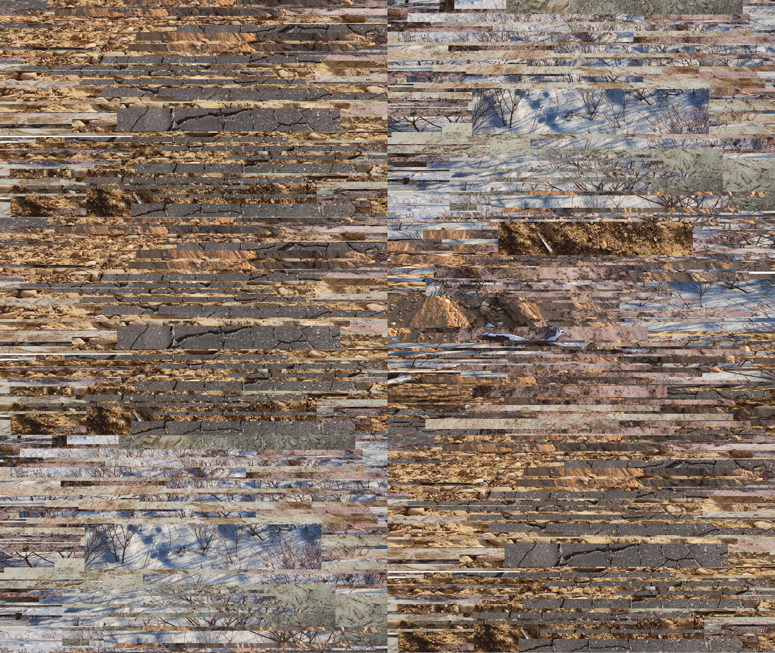
Slices

As I continue to consider time and its non-linear qualities, I was struck by the ability of a single moment to linger and stretch passed its expiration. The following image explores this idea:


In this piece, that same image is sliced, stretched and duplicated to convey a sense of repetition or memory. This is the most abstract I've worked. I am concerned about seeming unfocused, but overall, my concepts remain consistent and I am interested to hear the feedback during the upcoming residency.


This image is created in a similar way, using four different images from the same location during different times of the year. I've enjoyed working in this format. Ideally, these will be printed 4' x 12' and will unroll on the ground. The folds will emphasize the flatness of the paper and time as a single but flexible dimension.