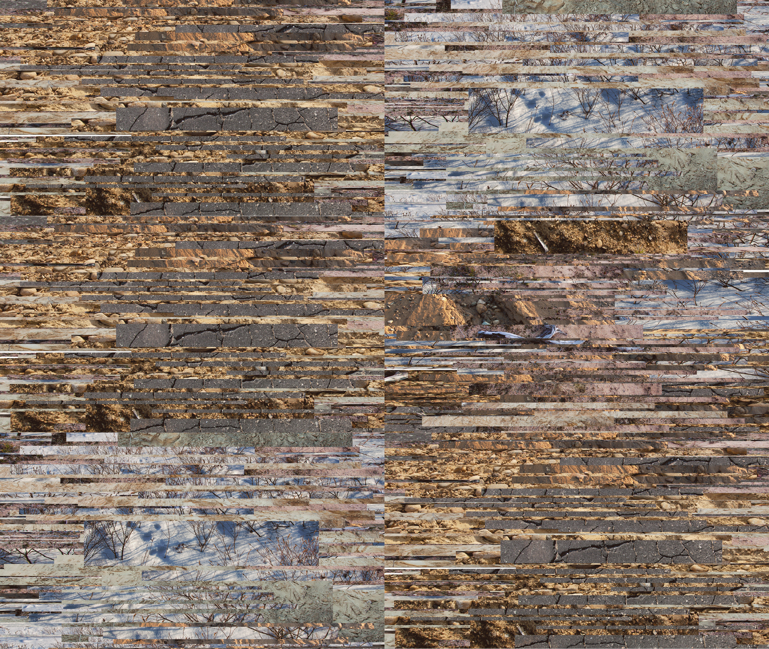
I made my first animated piece today. Peter Rostovosky said, while looking at one of my pieces, that he saw it very much as a GIF, moving. My previous advisor Matt Keegan has also suggested something along these lines, so I felt it was worth exploring. It was actually quite interesting to make. Each frame becomes a character. I don't like completely loosing the object-ness of the art, however. Perhaps this could be explored as part of a larger, physical piece. Or perhaps it was more of a study, which has already given me several ideas. Essentially, this GIF was made with two layers from the same original piece (recognizable, I'm sure, from the work I brought to the residency). I moved one layer up, the other down, and enlarged and shrunk the layers from frame to frame. My idea is that movement is sensed, but the direction is difficult to determine. 21 slides total. It might be a little large for regular internet viewing. I made it a slightly slower speed than I see most GIFs, thinking of Matthew Barney's comment that his films "move at the speed of art."

This is a second one with many more frames, making it a little more seamless (though far from actually seamless). Because it has more frames, I also made it slightly faster, which seems appropriate. This one has more of a narrative flow, but the narrative is circular. I like the mechanical feel of the shifts between the frames. Click to see it in full screen mode!
During one of my critiques, someone mentioned these images (as stills) reminded them of Windows screensavers. I will say I am getting that very strongly now that they are animated. I guess it's not really a bad thing. It makes sense considering the digital nature of the work.


These are really compelling and worth additional investigation. The bottom animation is definitely more seamless--but I like that it still retains a sense of pause-and-effect. Once they get too seamless, they may suggest "screen savers" as mine did (or maybe not--I'd try some seamless versions as well, just to see).
ReplyDeleteThe top piece gives me the a sense of construction and deconstruction, where I am allowed to chip away at, but never reveal, several interlocking states of matter and landscape.
The bottom appears to cascade downward, suggesting a waterfall, yet it remains geometric, denying the obvious, intentional beauty of waterfall structures. Here, geometrics behave like choppy water, but are allowed to retain their digitality and form, demonstrating they are capable of being ascribed various suggestive qualities, while still maintaining their identity. The long strips definitely move top to bottom, but the flecks and chips are ambiguous, sometimes staying put (though vibrating), other times vaguely climbing the fall. The scale and speed shifts, plus that interesting bisected green circle, keep me returning for more.
The top piece makes me think of Shaurya Kumar's work (I showed him to you at the residency)--where my access to landscape, in this case, is fractured by the digital, yet given the possibility to coexist in a new way.
The bottom is reminiscent of Len Lye.
Great work!
Thanks for the great feedback Ren! I appreciate you taking the time to check these out. Also, thanks for reminding me of those artists. Both are fitting references. I wasn't familiar with Lye's work, but I definitely see the connection. I love thinking of the bottom piece as "time fall," a kinetic suspension between two points in a way. I am trying a more seamless version to see how it works. Right now, I'm hand making each frame in Photoshop, which is rather time consuming. I think there's probably a better way. I'm not very video savvy yet though. Can you pan through an image in a film editing software? I think these are interesting, but I'm not willing to abandon the static image either.
DeleteSlightly less relevant, but do you happen to have any suggestions on material to look at on eastern scroll painting? Oliver suggested the format I'm using suggests the scrolls and could also work with how the scrolls re fence time. The time element is the part I'm most interested in. I know you have experience in this area so I figured I'd ask!
Absolutely agree about the bottom piece. Since movement intrinsically implies the passage of time, I find myself recognizing both a downward ("forward") linearity, with tension caused by points that seem to retreat, or reset time.
ReplyDeleteYou can definitely zoom, pan and move in video software using "motion" or "pan" (think of Ken Burns' documentaries). You can really dig deeply, or zoom way out, at any point. I use it to generate "camera" moves where none existed before.
I like the idea of retaining the contrast of still and motion, though. Definitely don't abandon the stills.
I've studied Chinese painting most specifically--but I think I have a bibliography that can help you out. I'll email it to you!