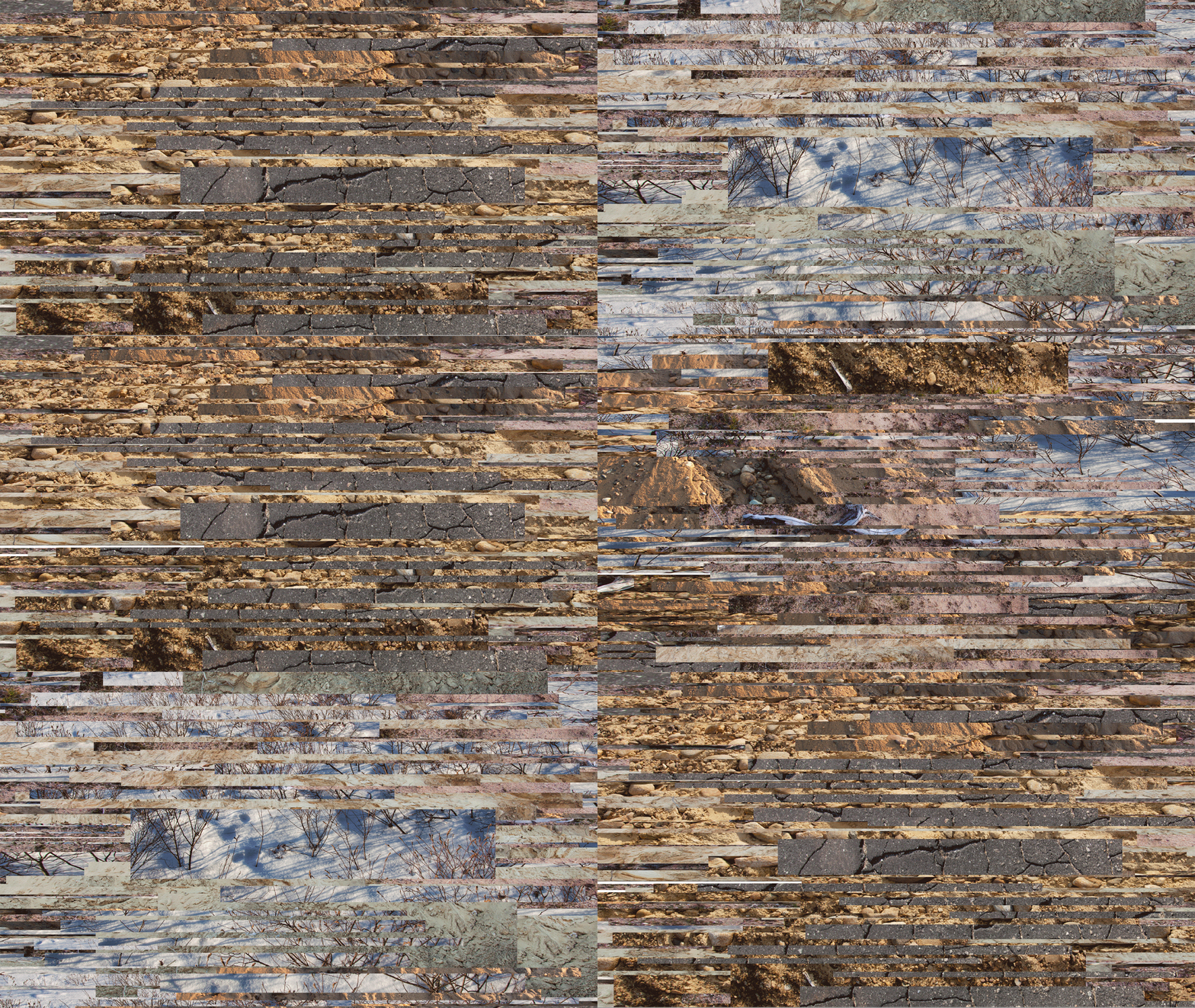
Tuesday, August 26, 2014

Weave

I want to expand the vocabulary of my current work beyond the strips I've been using. I started a couple pieces last week using that method, but it's not the same effect I want. It feels like a crutch at the moment. I was fortunate enough to stumble on David Samuel Stern's Woven Portraits recently, in which he combines two portraits of the same person, woven together. He prints the two portraits on vellum, and physically cuts and weaves the pictures together. The vellum is a beautiful choice for this work, providing a muted color pallet, as well as soft and subtle transitions that allow the grid of the weave to disappear in moments of similar color. I was remind of work I did during my undergrad when I first began to deeply explore digital methods. This is part of one those early pieces:


While thinking about this, I was also looking through my collection of scanned postcards. Oliver Wasow had mentioned the possibility of using older images to convey a sense of time, and I thought there might be some worthwhile options here. I discovered an old postcard from a the Notre Dame Cathedral in Montreal, which I had coincidentally just visited a couple weeks ago. This was one of my several attempts to combine one of my photographs with the postcard:


This image is interesting to me, but I think ultimately fails to communicate about time. I don't think the viewer would realize these images were from two different times exactly. I do like the details though:


This is from the center where the two crucifixes overlap. I love the Moire pattern from the scanned postcard. In my second attempt, I decide to weave the postcard image with itself. On an impulse, I expanded the second layer. I did this for about seven layers. This is the result:


I've been researching the Futurists and how they portrayed speed and movement in their work, as well as looking at more current artists like Robert Longo. Repetition is a key element in depicting time and I think in this piece, it works successfully. I feel this piece has an inner energy almost, and ripples.  I'm back to architecture at the moment. A building can preserve through decades, century or even millennia. There's the phrase "if walls could talk," and I think of this architecture as a witness to a long passing of time. I think of time like layers, and I try to visualize what it would look like if layers collapsed. This possibly isn't quite articulated visually yet in my work, but it something I am considering, pondering.


Wednesday, August 20, 2014

Animation

I made my first animated piece today. Peter Rostovosky said, while looking at one of my pieces, that he saw it very much as a GIF, moving. My previous advisor Matt Keegan has also suggested something along these lines, so I felt it was worth exploring. It was actually quite interesting to make. Each frame becomes a character. I don't like completely loosing the object-ness of the art, however. Perhaps this could be explored as part of a larger, physical piece. Or perhaps it was more of a study, which has already given me several ideas. Essentially, this GIF was made with two layers from the same original piece (recognizable, I'm sure, from the work I brought to the residency). I moved one layer up, the other down, and enlarged and shrunk the layers from frame to frame. My idea is that movement is sensed, but the direction is difficult to determine. 21 slides total. It might be a little large for regular internet viewing. I made it a slightly slower speed than I see most GIFs, thinking of Matthew Barney's comment that his films "move at the speed of art."


This is a second one with many more frames, making it a little more seamless (though far from actually seamless). Because it has more frames, I also made it slightly faster, which seems appropriate. This one has more of a narrative flow, but the narrative is circular. I like the mechanical feel of the shifts between the frames. Click to see it in full screen mode! 


During one of my critiques, someone mentioned these images (as stills) reminded them of Windows screensavers. I will say I am getting that very strongly now that they are animated. I guess it's not really a bad thing. It makes sense considering the digital nature of the work.


Monday, August 11, 2014

Residency 3 Begins!

It's incredible to realize I am half way through this program. I am currently relocating my studio, and seeing work I did even a year ago feels like a distant memory. While I continue to explore concepts that interested me prior to entering this Masters program, I know the work has gotten stronger, my concepts are maturing and my awareness of the contemporary art world has grown exponentially. I wrote a summary of this past residency experience, which can be read here.

Below are a couple of crops that were suggested during one of my critiques. Simplifying the imagery was a reoccurring suggestion. Leaving things a little more open ended for the viewer is something I want to do more successfully this semester.


I plan to continue to explore concepts of time as it relates to the digital, perhaps more specifically as it relates to digital photography. I am very hopeful to reach some resolution to these ideas, though I imagine such resolution will only evoke more questions. One of the things I have always enjoyed about the art making process is that it allows me to indulge in the exploration of curiosities I seem to possess in excess.